On the ball as always - even before I’d quite finished sorting everything! The links at the top all work now, as does (as far as I know!) everything else. You may also notice that there’s a little bar reminding you of the title of the thread you’re reading when the title would otherwise have scrolled off the top. A handy feature which has always been a part of the software, but I could never quite make it work together with the the SSi header previously, so I’d hidden it. I think this solution (where it is hidden unless used, and I’ve shrunk the size of it slightly) works quite well - feedback welcomed 
4 Likes
@Kinetic Yes, I like seeing the thread title. And there’s a little icon to navigate back to the main page next to the title. Sweet! Diolch ! 
1 Like
There used to be a sort of “speech bubble” at the head of the page, where a number appeared to indicate the number of replies, “likes”, private messages etc, you have received. That “speech bubble” seems to have disappeared?
Click on profile (your picture) icon at the top @gavinM . It’s everything there. It seams I have to post picture here too so here you go:
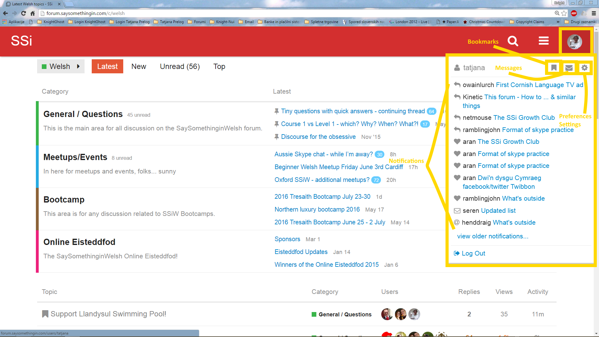
(this is the old(er) picture but the profile thingys and notifications remained in the same position/area as they’re now.
Very handy for me when trying to explain something in the thread. Diolch.
Yes, If we’d be on the TeamViewer I’d see you working … The colors and bars went on and off as I’ve cruised the forums. - hehe … You can’t escape me (although you could if wanted as you’re computer geek and I’m not. )
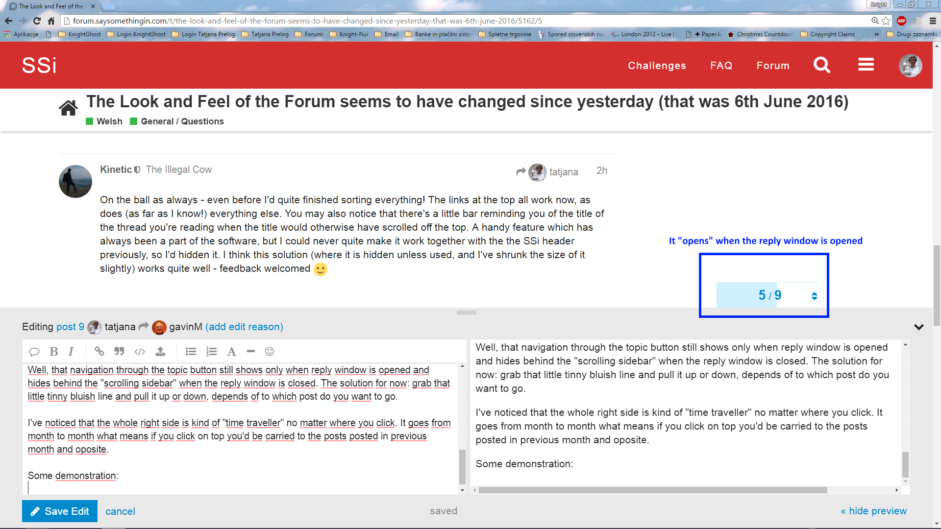
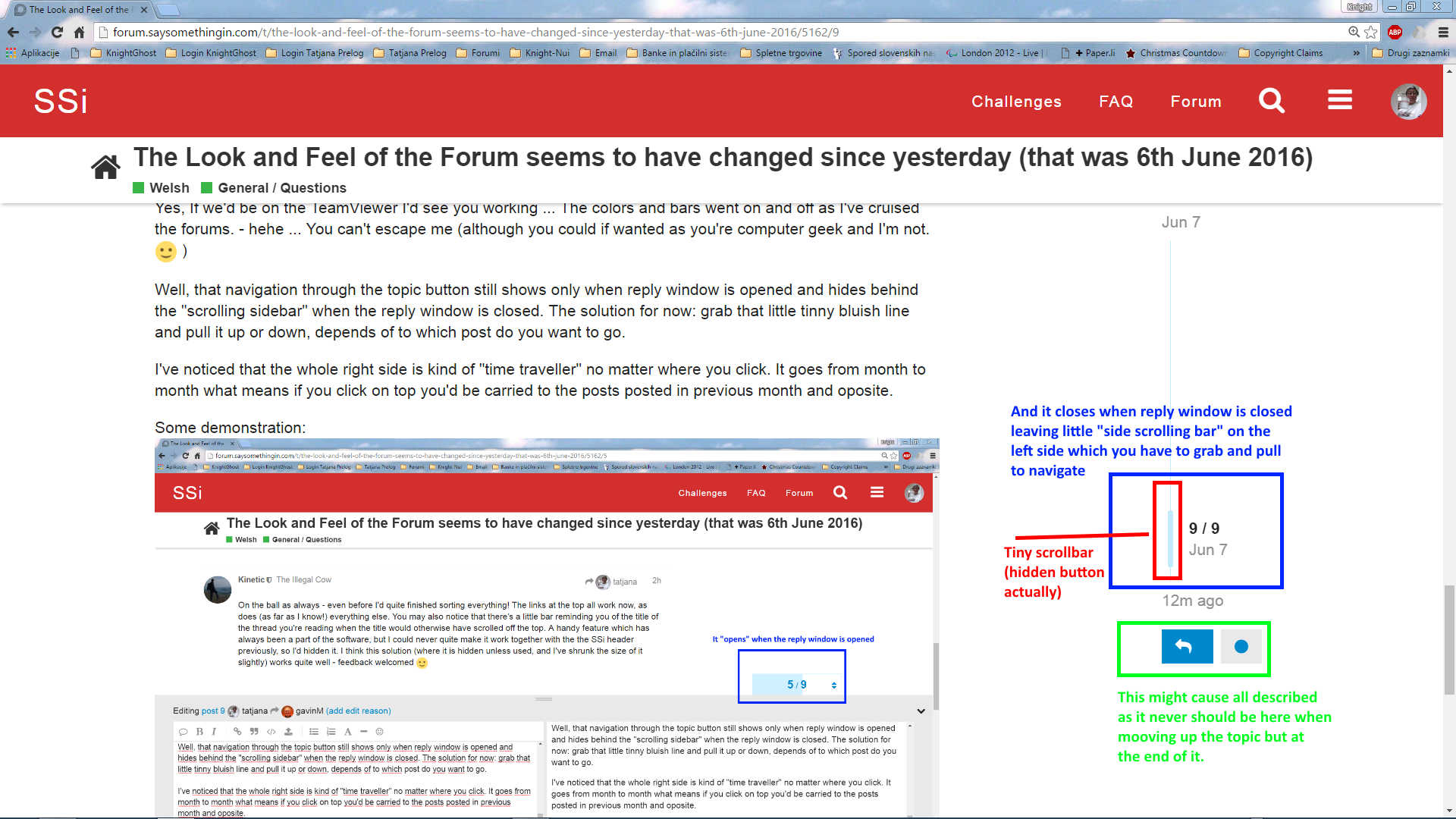
Well, that navigation through the topic button still shows only when reply window is opened and hides behind the “scrolling sidebar” when the reply window is closed. The solution for now: grab that little tinny bluish line and pull it up or down, depends of to which post do you want to go.
I’ve noticed that the whole right side is kind of “time traveller” no matter where you click. It goes from month to month what means if you click on top you’d be carried to the posts posted in previous month and oposite.
Some demonstration:
.
I presume this has something to do with positions of frames on the site/forum.
Well this much I could establish and it might help you in a way @Kinetic.
1 Like
…And as an encore, the forum now follows the main website’s colour preferences (i.e. if you’ve picked the green or blue appearance for the main website instead of the default red, the top bar on the forum will be that colour too).
Regarding the navigation scrollbar thingy - I’ve had a look in the settings and can’t see anything about it at first glance. I rather like it though - seems a lot easier to drag a bar around than to click and then guess post numbers…
1 Like
Well, I didn’t use it for anything but going to the beginning or end of the topic but to go to the beginning is sorted out. You click on the title of the thread and you’re at the beginning.
You’ve got me here! I’ve “dropped off” the ball and comming back on surprisingly found out it follows my color.
Good work! I love it actually.
2 Likes
I like this a lot
And this, too! Diolch! 
(And apparently we have some new emoticons, too!)
1 Like
Didn’t investigate this yet … Thx for reminding me.
1 Like
@Kinetic: I can’t now remember exactly what it looked like before, but it seems to me that the little numerical icons which tell you if you have any messages outstanding, or if there are any replies to your posts or if someone replied to a post you were following, have all moved over to the right edge of the screen (over one’s personal avatar), where they are in danger of being missed.
(especially as the message one is in a green circle on a green background).
They were much less easy to miss where they used to be (was it over the “magnifying glass” icon?).
I’m using a desktop computer with a separate, average size (i.e. not small) screen. I don’t know what it’s like on a laptop, tablet or phone, but on my screen, there is a lot of empty space in between the SSi on the left, and the “Challenges etc”, so that whole group of stuff on the right could afford to come left a bit, and so the number-icons indicating messages/posts might not seem quite so “lost” over on the right.
(The “green on green” would still be a bit of an issue though).
Yes - that’s good. Thanks.
1 Like
The numbers are there (if present) even without clicking, but easier to miss and harder to see, if, like me, you chose a green site background colour.
@Kinetic: I’ve now seen that the forum follows the site colour options which is good, but perhaps you now need to think about choosing colour backgroounds for those “number icons” (can’t think of a better name) which don’t clash with any of the site/forum-colour options? - by “clash” I mean things like “green on green background” which don’t show up … the actual number shows up because it’s white, but the little disc thing doesn’t, so it can more easily get lost from view.
I’m afraid that’s the sort of thing that is up to the developers of Discourse, and they’ve decided to change how it works in the new version by merging the notifications into the user menu, as @tatjana already observed . Colours and stuff I can change, but the choice of which menu the notifications belong in is just up to how the software itself works I’m afraid.
However, speaking of colours and stuff:
I’ve put little white borders around them now - how’s that? I tried it with a neutral colour like grey as background, but it didn’t look so good. Suggestions welcomed.
1 Like

#ffff00 - Yellow circle
#000000 - black number in it
Those colors are nowhere on the bar so they should be highly noticed. Maybe black circle around also to make thing more visible.
Just a suggestion
1 Like
I believe you are correct, I told one of my kids what it was called the other day and was informed I shouldn’t know things like that because I was a digital immigrant! :-S
3 Likes
[quote=“AnnaC, post:12, topic:5162”]
(And apparently we have some new emoticons, too!)[/quote]
I noticed this too, and am delighted!  These are much better than the old ones.


2 Likes
Miss dragons. Did you find any. The one who breaths fire is surely me. - haha
1 Like
I’m not having any trouble seeing my notification circle, and I have the green background, so the current solution works for me. However, I don’t have a photo for my avatar, so possibly the fact that mine is a simple yellow circle with an “A” in it makes the notification easier to see.
@tatjana, I found two dragons, but I’m not impressed: 
 ( “dragon” and “dragon_face”)
I like this old one ![]() better
better

Hehe … I remember this one however it seams I can’t find the way to find them and use them for that part …
I love that one too.
1 Like
The post with the links to the dancing dragons is here:
You have to put the link for the dancing dragon on a separate line in your post, by itself.

Mwynhewch!
1 Like
Diolch yn fawr iawn.
Yes that’s how .gif images work on this forum. My animation in some posts I’ve posted work the same way, too.
I should simply bookmark them in my browser and problem is solved.
EDIT
Thjs still awaits, but EURECA! Thanks to this post and to you @AnnaC posting the link to the topic I’ve got the idea: Fro now on, if you forget where to find the dragons, you’ll find the link to @essenbee’s post in ["Really useful stuff] (Really useful ‘How to’ stuff and other great posts) list… This should do some trick for newcommers to find those little cute dragons. They are in the link “Emotions, coding and more” actually too, but it doesn’t hurt to have them separately though
Oh, and by the way: I’ve noticed that putting links into the post work a bit differently now too so it’s the best that instead putting link in the post first, you put the text you want to display in, mark it and then go for posting the link on it. (well, just a mention so you’d know.
2 Likes