This forum - How to ... & similar things

Aha. This doesn’t go globally then.

Discourse uses an <iframe/> element to “embed” the document, meaning that the forum sends the URL down to the web browser, and it’s your web browser that loads the URL, not the server.

So the forum itself won’t run any slower, but an individual post that links to a large document will have an increased load time, because it means that two web pages are loading instead of one.

OK. Thanks. This comforts me. Then it’s up to us and how “friendly” we are to other users and I knwo we’re very friendly though. :slight_smile:

Diolch yn fawr iawn.

Seems to be 2 months.

Oh. Well, January 20th we might find out if it’s the same for wiki posts…

OK, people, let’s continue a bit with this stuff.

Well, I’ve noticed already qute some time ago, but it’s tendency here again, that some members seam to not be aware they can edit their posts (I believe) no matter what level they are and this for they delete them rather then edit. I’ve also established that deleted posts ARE NEVER REALLY DELETED at all so it might be if you still want to post a reply but you just didn’t forge it right or to your desires, better you edit the post rather then delete it.

So I’d show you today how to edit posts.

Well I know I’ve posted this once in one thread seing the question about that but that thread was not specifically meant for such things and the post might be lost in the flow of the posts and besides, I didn’t post any pictures there (but I love so much to present things with pictures. - hehe). So, here we go.

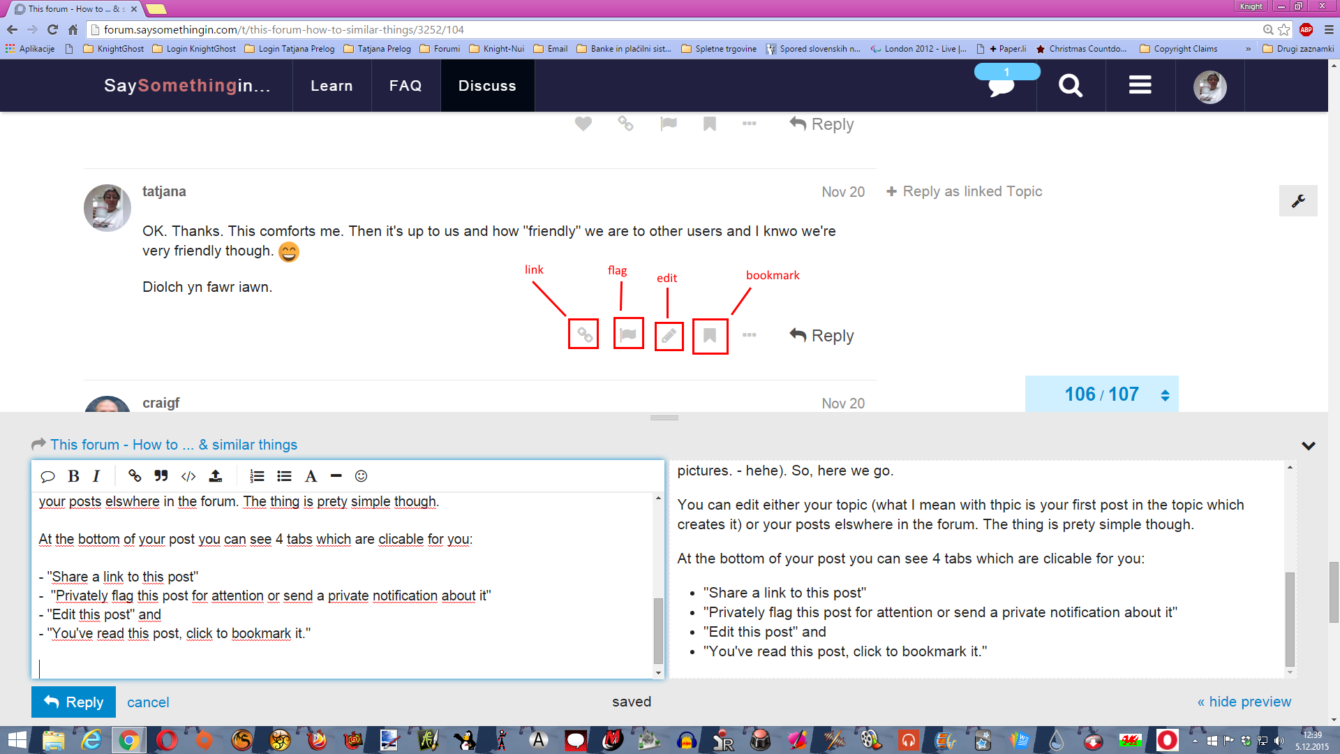
You can edit either your topic (what I mean with the topic is your first post in the topic which creates it) or your posts elswhere in the forum. The thing is prety simple though.

At the bottom of your post you can see 4 tabs which are clickable for you:

  • “Share a link to this post”
  • “Privately flag this post for attention or send a private notification about it”
  • “Edit this post” and
  • “You’ve read this post, click to bookmark it.”

You do the following:

Go to the post you want to edit and click on the “Edit” button (represented with little pencil).
The post will open as if you’d just be in writing of it just that you’ll already have the text written in the window.

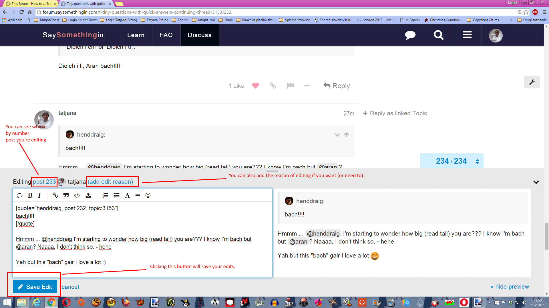
And there is something more tinny things different from writing a new post window. As you see when editing you can see which post by the count you are editing and you can even add the reason of editing it despite it (as much as I’ve experienced this feature) this last doesn’t work as I’d expect and want so I usualy don’t write reasons of editing this way though.

From here things are simple. Edit the text to your desires (you can actually totally rewrite it if you want too) and then click “Save Edit” button at the bottom of the window or click “Cancel” one if you changed your mind and don’t want to edit the post at all.

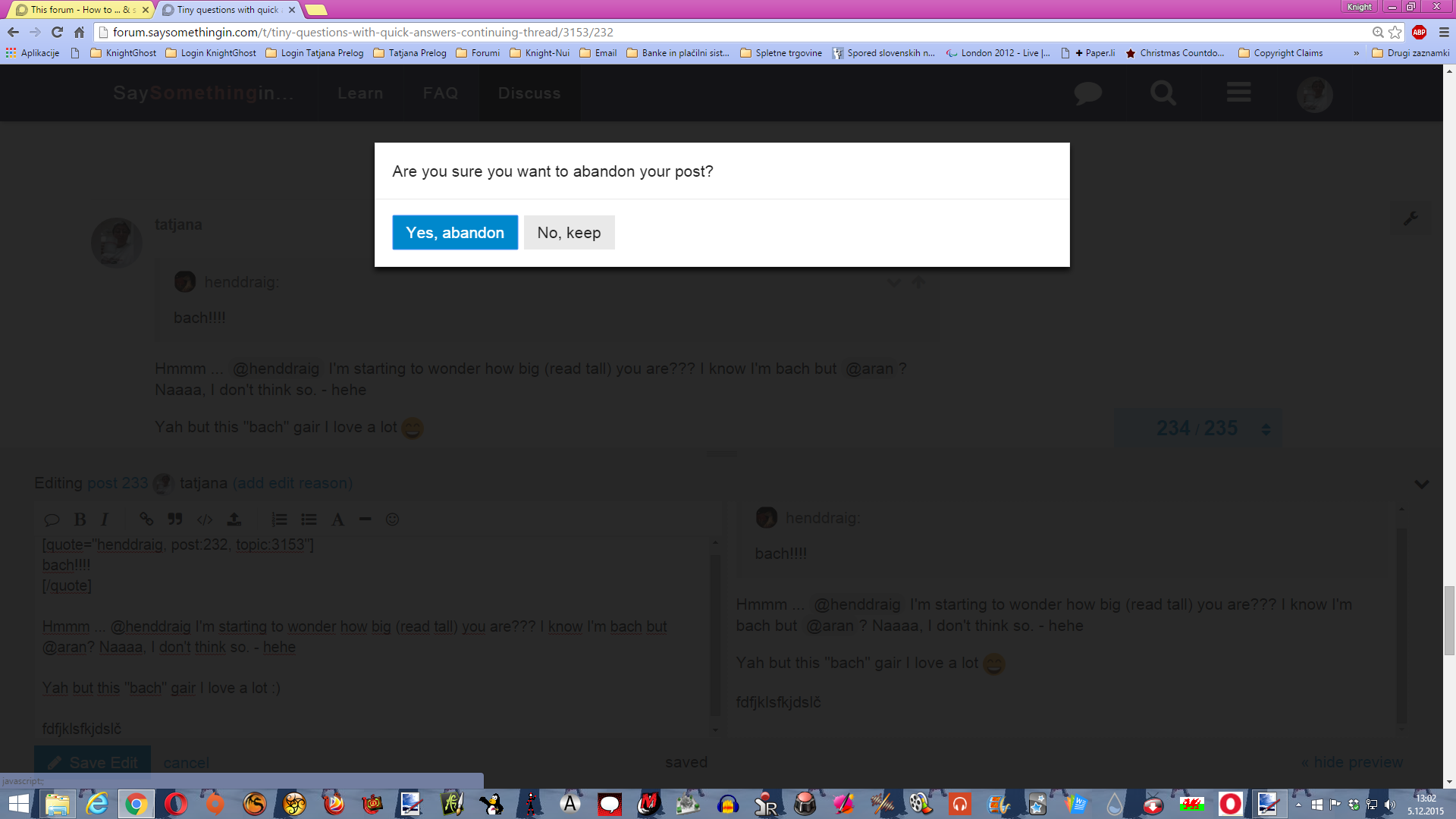
When you choose not to edit the post and you cancel editing you’ll get this window (if you already have edited some of the text (or whatever).

Clicking on “Yes Abandon” button will cause your edits to be lost and your original post will remain untacked. If you click on “No, keep” button you’ll be returned to the editing post, edit window remain opened and you can still make up your mind whether keep editing, saving edits or abandon them.

If you just opened the window but didn’t do anything yet then clicking to “Yes Abandon” would do nothing but just close the post you were just about to edit and nothing will happen in that matter.

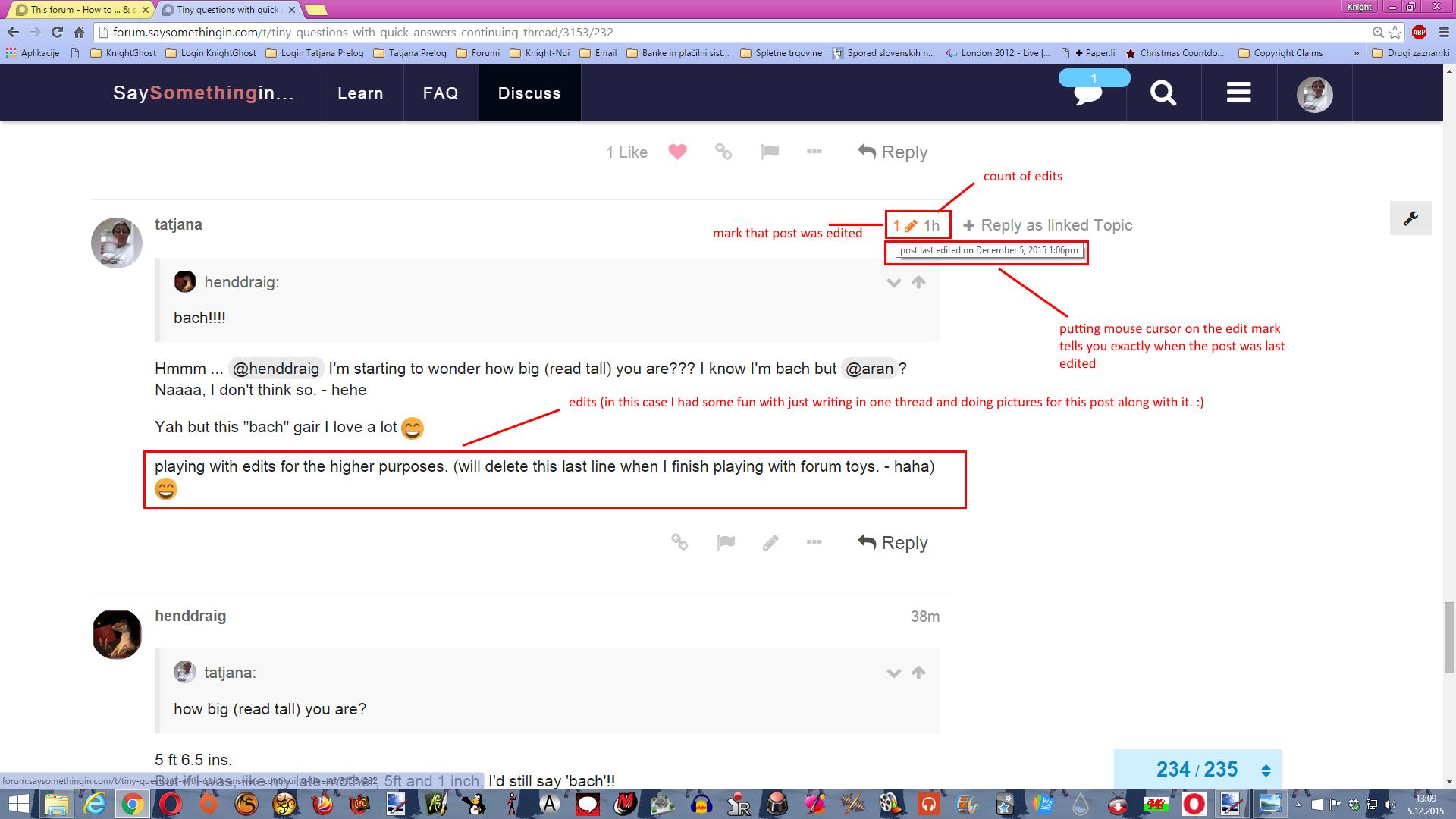
Saving edit you’ll notice two things: that your edits are now visible in the post immediately and a little red pencil at the right top of your edited post which tells everyone that this post was edited and the number tells you how many times edits were done.

So this way you’ve done your editing what is surely better then deleting the posts except if you really don’t want to post anything at all and you have nothing to edit in this matter though.

However here comes the important notice/allert: The number of edits is LIMITED. I didn’t establish whether by the time or by the number of edits you’ve already made but I think the case is the last thing though so be careful how many times you edit one particular post especially if you tend to edit them more then once. (I believe number of edits is limited to 7).

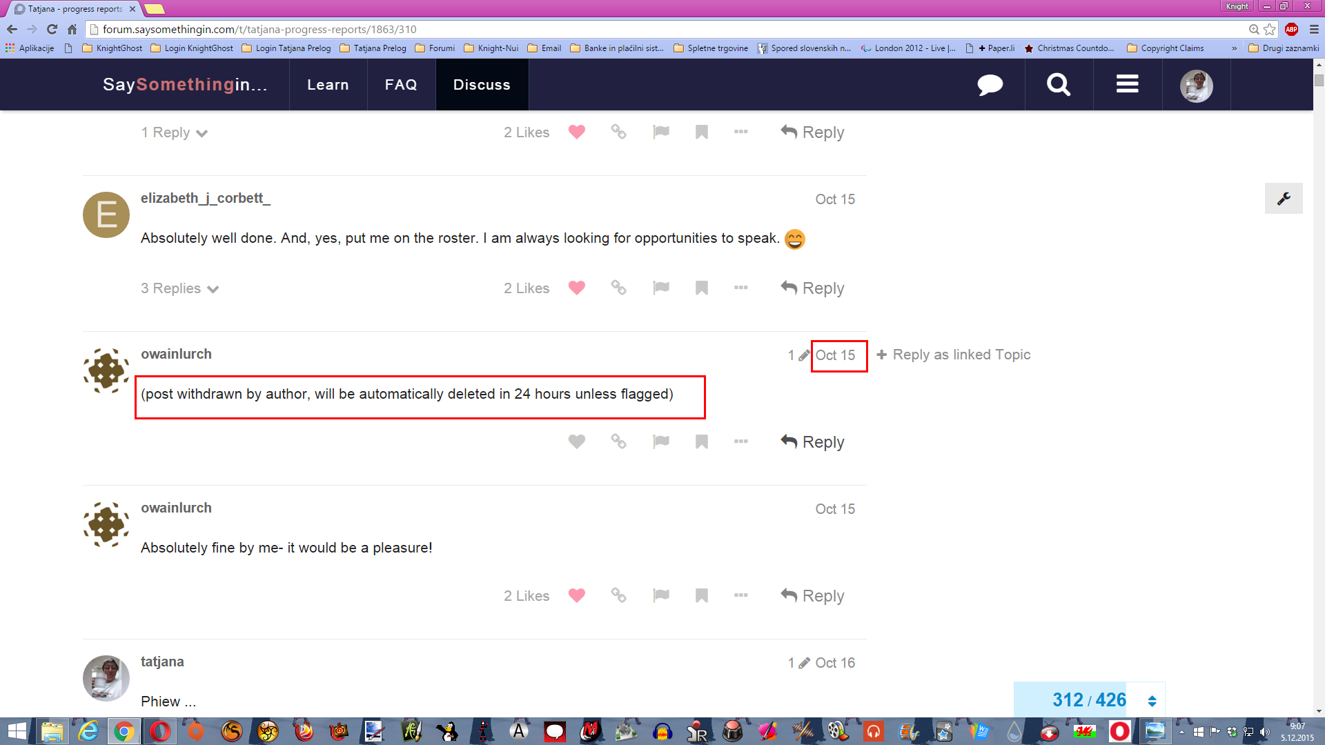
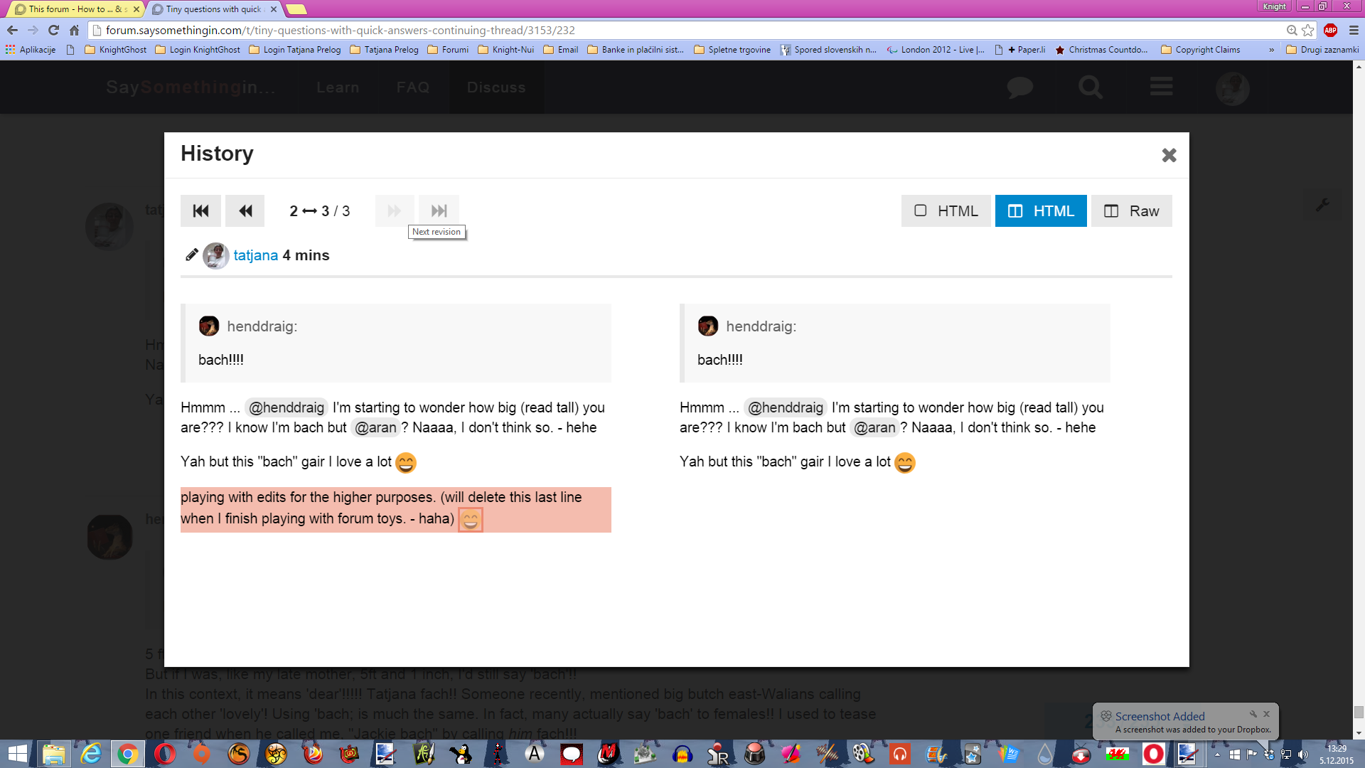
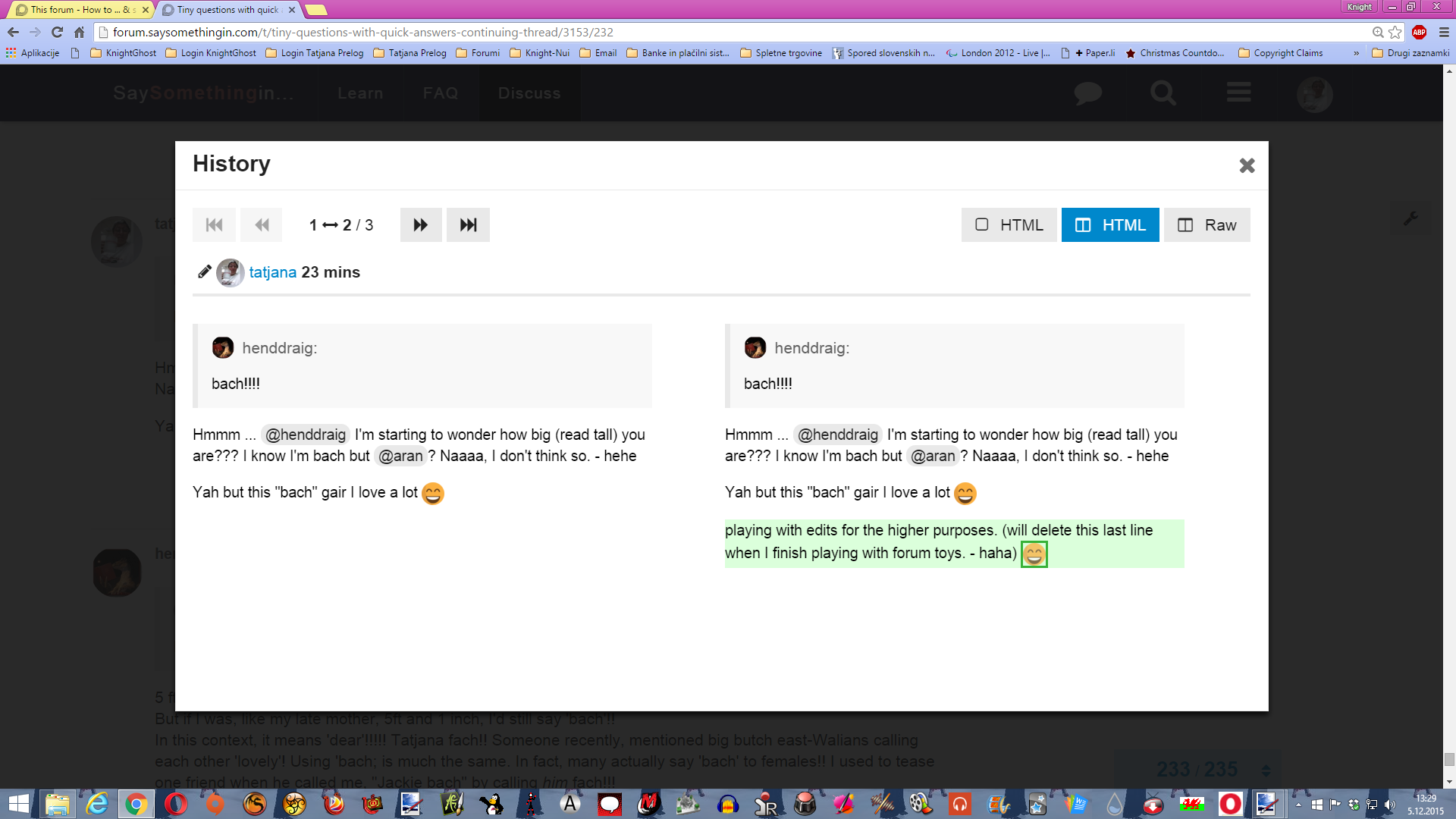
Now for the bit of magic. You can always see your edits if you click on that red pencil on the top of your post (which in a time becomes grey but I didn’t qute establish why yet). You can see all your edits (or edits maybe mods or system have done) of your post in a row as they happened beginning with last edit first.

Last edit I’ve made:

older edit (in this case the first as there are only two) I’ve made

Left side representing old post marked red what was edited out or differed and right side is edited post which presents with marked green what was added or changed in last (now visible to all) edit.

Those edits of posts are visible only to the author and to moderators and admins and no one else though so there’s no fear one would be able to see what you’ve altered, deleted edited out, corrected and what’s more to that.

I should still mention that if you edit your post immediately after you’ve posted it, the system gives you ceartain (short) amount of time which doesn’t count as edit and it will not be counted into edit count but I didn’t quite establish what short amount a time this is but surely it counts only if you didn’t leave the thread you’ve posted in and edited post afterwards.

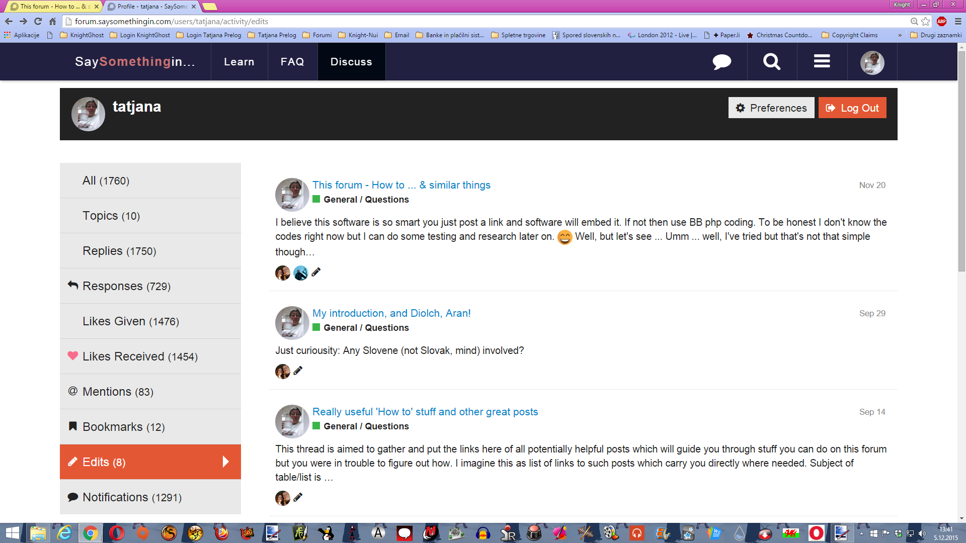
Some edits done by you or member of stuff you can also see if you go to your profile and click on “Edits” link on the left but I’ve established not all edits are visible there though.

You can see who edited your post (were that you or moderators (or the system)), how many posts were edited and clicking on the title of the particular post drives you to that post where you can view edits as described before.

Well this is all the magic of editing and viewing edits.

I strongly recomment editing the posts rather then deleting them and writing the new ones in a row. The threads can be shorter and much more readable not being filled with deleted posts which don’t vanish at all if even it writes they would in 24 hrs.

Oh, and one more thing: This way you also can edit your replies in personal messages but what you can’t edit in PMs is the very first post you are writing as a PM. What means if you write PM to someone you should be extreamly careful with writing and better doublecheck it before you send it because you won’t be able to edit it anymore (despite you have the button to edit it though).

Enjoy posting and editing. :slight_smile: .

1 Like

Just to let you know that I’ve edited the bit of How to send PM a bit to tell you how to add additional receipients of the message when it was already sent.

Enjoy. :slight_smile:

3 Likes

Now I’ve decided to post some posts in a row with the common topic What to monitor on this forum or what sort of things all those things you see (like icons of the users, links of the posts, numbers of the posts etc) hide behind the scene. So, I’ve named this contigent of posts with the common title “Secrets revealed or what you can monitor on the forum”

Since these desctiptions can be quite long (they might be the whole documents of several pages, the post might be too long for patient reading so I’ve decided to post them as embeded document. So, let’s begin with

The upper (dark) bar

Note: Scroll down the embeded post in order to read it all. use lower abr of the embeded post in order to move left and right (if neccessary in order to see the whole picture)

https://docs.google.com/document/d/10N4Sma8wHtCnT5eYqnb0iU-syOX42d9uwhwkyqukn2U/pub

EDIT to add that things in the upper bar changed a bit, but just visually, all the rest is as it was. The upper bar is red now and the “Learn” page becomes “Challenges”, all links mooved to the right. The look is more modern but the functions are the same.

4 Likes

Now, let’s continue our “journey” around the forum and the topic of what you are able to track, and see. This time the theme might not be so interesting for you but still I’ll post it for the guide to be complete.

As I said last time, we’ll take a look at the rest of the main page but since I want for posts not to be too long we’ll see only Categories/topics part this time.

Categories/Topics part of the main Welsh categorie page

Hope, despite this topic can be a bit boring for many of you, you’ll manage to see something new and interesting in it.

Happy reading and exploring. :slight_smile:

1 Like

Here are more interesting data about what you can view and track on the forum. This time we’ll take a look to lower part of the main Welsh page where list of topics is displayed with all sorts of things you can see. So here we go with

Category list and its data

https://docs.google.com/document/d/1mL9kNNGMNtBV3B37HdOOS8cyPckeb38F_DkLIg_uhbc/pub

Hope you’ll find something useful in this guide.

Enjoy. :slight_smile:

1 Like

Well, I’m back (like every weekend in a row for some time now) and here I have more to reveal. This time, as I’ve promissed we will walk through one topic and see what you can see there. Despite I tend to limit my series of posts mostly to what you can see or track, I couldn’t totally avoid some utilities provided with this. So let’s begin with

Walking through one thread/topic

Here we go …

As you know, scroll down the embeded post in order to read it.

I hope it helps not only monitor the statistics of your or nayone’s post in that matter (if this is in your interest) but also use some shortcuts to cruising faster through the forum, topics and what’s more to it.

Enoy exploring, monitoring and posting.

Hwyl!
:slight_smile:

2 Likes

Well, do you remember this?

This somehow was not posiible to do on my tablet until today but today I actually managed to quote part of one’s post and then even make reply window to open in order to quote in it. I figured out I have to “tap” a bit harder on the screen so the marks for marking text appear and then pull at need to mark the text you need. It showed “light box” with “Quote” written in it. Not easy to do as it not always works but now I know it can be done.

Also referring to the post 16 where I’m describing the menu and upper bar on the tablet, I found out that if you have a good guessing where the tabs on upper bar might be, you can go just fine along with those “bugs” and tap jus tthe right tab despite you can’t actually see it.

So, tablet/android problems solved in a way for me at least temporarly.

1 Like

Just to let you know that I’ve added something into the last “Walk through” post what I forgot to mention before but can come very handy to all.

Also big DIOLCH to @theblacksparrow for mentioning that Google docs can be embeded into this software. It’s very handy when editing the document since you don’t need to come on here and edit but you can edit at your own will without altering the original (forum) post. I love this more and more … Can be a bit of a problem if/when Google Docs drop down … :slight_smile:

1 Like

Well, before I go to bed, I just wanted to continue my series of guides first. As I promissed, this time you’re invited into my “private apartment” - the members area. Since this post would be too long if I’d explain all in one file, I’ve rather split it into two parts again. We’ll go through the “contro room” of the members area - settings and you’re warmly invited to enter it with me. So, here we begin with Member’s Profile - “private apartment” with a view

https://docs.google.com/document/d/1kbwSeLEFzEdRt2RUqS8RZo6J7SGyPiVmiIZo_W-fdeo/pub

1 Like

Well, here we are again after quite long break. As promissed we’ll continue our tour through the “Private apartment” with the view. I believe we shouldn’t waste any more time so here it is:

Member’s Profile - “private apartment” with a view - Walk Around

https://docs.google.com/document/d/1wjP12ggoA8vsDhmSxf41fHDrY6mpAbEWB_OD7EBKyxw/edit

Well, this is the last part of the How to guides I’ve posted on the forum all this time. I hope you could find something useful in them. But, of course, if you have some more questions you find I didn’t cover in any of the guedes, you’re welcome to post them in this topic and I’ll answer them or point you to the post which contains the desired answer to your question.

Happy exploring and posting.

Have fun!
Tatjana

2 Likes

WOW! Look at this! The new site design is spreading to the forum!

Da iawn!

I know, I know … only upper bar … but I still like it!

2 Likes

Except that the Site colour (in Welsh anyway) for me is Green (can’t remember if that is something I could set for myself.

The forum colour is a rather glaring and distracting RED.

I wish I could either change that or tone it down a bit. It “clangs” rather (for me, anyway).

Maybe there’s purpose. People often mix site with the forum and to make a difference the forum banner is not adjustable. I felt it should be “toned down” a bit too at the beginning but now I just don’t mind at all. For me as long as it isn’t green (sorry but I must not let too much of a green in my life (long and rather sad story though …)) it’s OK.

Some of us were able to get the new site format (as a ‘beta’ trial) a while ago and, at the time, we had the ability to change the color. I think the choices were red, green and blue. I had chosen blue but now it is red and I really don’t prefer that!! If I can’t have blue I’d rather have green, but I can’t find where I can change that.

1 Like

@sionned not on the forum part … only on the site. On the forum the banner (which is now red) is not changalbe. On the site you still have your choice but you have to be logged into the site (not forum, this is separately) if you want to get this option.

Mind dear SSiWers - despite forum is the part of the SSi, technically it’s totally separated site from the SSi Learning page!!! So you have choice to change colors (among all other things) on the Learning page, where Challenges, lessons etc, are, BUT you DON’T HAVE these options on the forum as it’s also totally different software from the site.

So much about banners, colors and stuff and their “division” to forum and site.

Happy browsing, learning and coloring. :slight_smile:

1 Like