This forum - How to ... & similar things

Well, do you remember this?

This somehow was not posiible to do on my tablet until today but today I actually managed to quote part of one’s post and then even make reply window to open in order to quote in it. I figured out I have to “tap” a bit harder on the screen so the marks for marking text appear and then pull at need to mark the text you need. It showed “light box” with “Quote” written in it. Not easy to do as it not always works but now I know it can be done.

Also referring to the post 16 where I’m describing the menu and upper bar on the tablet, I found out that if you have a good guessing where the tabs on upper bar might be, you can go just fine along with those “bugs” and tap jus tthe right tab despite you can’t actually see it.

So, tablet/android problems solved in a way for me at least temporarly.

1 Like

Just to let you know that I’ve added something into the last “Walk through” post what I forgot to mention before but can come very handy to all.

Also big DIOLCH to @theblacksparrow for mentioning that Google docs can be embeded into this software. It’s very handy when editing the document since you don’t need to come on here and edit but you can edit at your own will without altering the original (forum) post. I love this more and more … Can be a bit of a problem if/when Google Docs drop down … :slight_smile:

1 Like

Well, before I go to bed, I just wanted to continue my series of guides first. As I promissed, this time you’re invited into my “private apartment” - the members area. Since this post would be too long if I’d explain all in one file, I’ve rather split it into two parts again. We’ll go through the “contro room” of the members area - settings and you’re warmly invited to enter it with me. So, here we begin with Member’s Profile - “private apartment” with a view

https://docs.google.com/document/d/1kbwSeLEFzEdRt2RUqS8RZo6J7SGyPiVmiIZo_W-fdeo/pub

1 Like

Well, here we are again after quite long break. As promissed we’ll continue our tour through the “Private apartment” with the view. I believe we shouldn’t waste any more time so here it is:

Member’s Profile - “private apartment” with a view - Walk Around

https://docs.google.com/document/d/1wjP12ggoA8vsDhmSxf41fHDrY6mpAbEWB_OD7EBKyxw/edit

Well, this is the last part of the How to guides I’ve posted on the forum all this time. I hope you could find something useful in them. But, of course, if you have some more questions you find I didn’t cover in any of the guedes, you’re welcome to post them in this topic and I’ll answer them or point you to the post which contains the desired answer to your question.

Happy exploring and posting.

Have fun!
Tatjana

2 Likes

WOW! Look at this! The new site design is spreading to the forum!

Da iawn!

I know, I know … only upper bar … but I still like it!

2 Likes

Except that the Site colour (in Welsh anyway) for me is Green (can’t remember if that is something I could set for myself.

The forum colour is a rather glaring and distracting RED.

I wish I could either change that or tone it down a bit. It “clangs” rather (for me, anyway).

Maybe there’s purpose. People often mix site with the forum and to make a difference the forum banner is not adjustable. I felt it should be “toned down” a bit too at the beginning but now I just don’t mind at all. For me as long as it isn’t green (sorry but I must not let too much of a green in my life (long and rather sad story though …)) it’s OK.

Some of us were able to get the new site format (as a ‘beta’ trial) a while ago and, at the time, we had the ability to change the color. I think the choices were red, green and blue. I had chosen blue but now it is red and I really don’t prefer that!! If I can’t have blue I’d rather have green, but I can’t find where I can change that.

1 Like

@sionned not on the forum part … only on the site. On the forum the banner (which is now red) is not changalbe. On the site you still have your choice but you have to be logged into the site (not forum, this is separately) if you want to get this option.

Mind dear SSiWers - despite forum is the part of the SSi, technically it’s totally separated site from the SSi Learning page!!! So you have choice to change colors (among all other things) on the Learning page, where Challenges, lessons etc, are, BUT you DON’T HAVE these options on the forum as it’s also totally different software from the site.

So much about banners, colors and stuff and their “division” to forum and site.

Happy browsing, learning and coloring. :slight_smile:

1 Like

How do I download the lessons. There is no download arrow against the lessons now.
Is there an SSiW app so I can get my lessons on my iPad?

Mary, did my answer to this question on another thread help you?

1 Like

I just checked on this, because I’d noticed that too. Under the big Play arrow is a long black line. At the left hand end is a sort of symbol. Clicking on it downloaded that Challenge. I hope that helps!
To @aran I do think it is confusing. Could an instruction about how to download be added? p.s. Croeso n’ol. We;ve missed you!

1 Like

Thank you, Louis. I did not know what you meant by the progress bar but to the right of the lesson number there was a faint small rectangle and on clicking that it said download and that did the trick.

Sorry not to be on the Forum much but I have never found this forum easy to use. I do the think all the new replies should be at the top of the lists and not at the bottom. I don’t have much spare time and find this very time consuming. However I do keep up the Welsh learning. Love it and am so pleased the southern lessons are forging ahead.

1 Like

@mary_worrall, it’s even easier then that because the software drives you automatically to where you stopped reading one topic so it should be super easy to use this forum. If you have questions about the forum, instead of scrolling up this topic you have an index made in the “Really useful ‘How to’ stuff and other great posts” in this post In it you’ll find all things you need for easier use of the forum from how to post pictures, links, quotes all the way to how to reply, send PM, what you can monitor and follow on this forum and similar stuff. Take a look. Clicking on the links of your interest carries you directly to the post in this thread where all is explained with text and pictures so in time I don’t have any doubt you’ll find this forum super easy to use and handy.

The appearing the forum to be complicated to use mustn’t turn you away from posting your questions, thoughts, happy moments or problems on here so you’d get help or you’d share your happy things with the community and that’s the thought with which these instructions were posted on this forum - to help users with technical/appearance problems.

Enjoy the forum and if you have the question about anything regarding this forum, instructions or any thought about what still could be explained, you’re free to write all in here and we’ll try to answer/explain things if we can. :slight_smile:

Hwyl!
Tatjana

1 Like

Ups, @Kinetic or whoever updated forum right now. This didn’t go too well I believe. The “walk” through the topic up and down shows only if you post reply (when Reply window opens), the notification button when you have messages of PMs spreads actoss the all 3 icons (search, hamburger menu and profile pic). Dropdown menu when clicking on 3 stripes is OK though and yes, for all of you, notofication menu is now merged with Profile menu.

Actually that “walking through topic” tab is that annoying thing … .

This one:

When I close reply window it appears like this (it doesn’t appear actually).

It appears more like “I feel lucky” click on Google which brings you where you want to go or it doesn’t bring you there …

So much for the record…

I’d probably have to update instructions when changes fully take place … :slight_smile:

I had a feeling you’d be on the ball and notice this quickly :wink: Most of the things you describe are just a consequence of upgrading to the latest version of the forum software, and not something I’m really in control of - I think they’ve just changed the behaviour. I’ll have to have a look and see whether it’s possible to re-enable the topic navigation thing.

Meanwhile the appearance issues are something I need to sort out, but due to technical reasons I won’t go into, I’m struggling to do this. (And I was trying to do this late at night to minimise the impact of any downtime… sigh :))

You can’t be as late at night as I am. - hehe :slight_smile:

It’s not catastrophe anyway just that navigation button is the isue I’d really like to be sorted …

Oh, and just for the interest, here’s the “notification allert” button. In time I might even like it. :slight_smile:

The notification badge thing and a couple of other design bits have been sorted now. The buttons from the top bar are still missing; I’ll have to look at that tomorrow now. Functionality seems to be restored, though :slight_smile:

1 Like

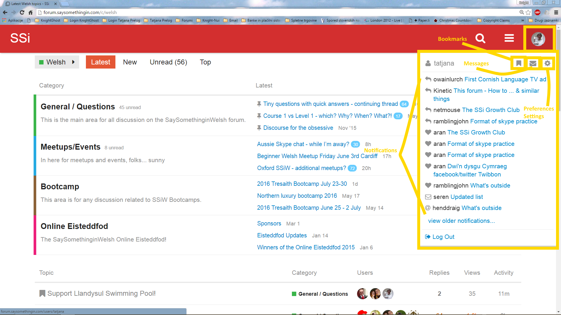
You’ve probably already spottet some design and utility changes to the forum what is result of latest updates of the software on which forum is running. To avoid the confusion, here’s a little (picture) update to my instructions. Basically the functions which were before split into two tabs (notifications and profile) are now merged into one. Clicking on your profile picture you can get everything there now - notifications, messages and settings. Notification icon with number of unread notifications (when you have some) appears at the very right upper corner of the page (on the right above your profile icon/picture) and is slightly smaller then it was before but still kind of azzure colored.

Here’s the picture:

Happy browsing, posting and messaging (among all the other readings and stuff you tend to do on here) :slight_smile:

1 Like

Hmmmm … @Kinetic was in a bit of work again I see.

Did you all notice how direct replies to one particular post are shown now? It’s like this:

I actually like this.

Also, the links to the topics linked in the particular post are not at the right anymore but at the bottom of the post which contains those links.

So, the “Really useful stuff” topic where there are quite some links would look like this:

There are too many posts I’d need to edit for new look and feel but I’ll try slowly to go through them and do things. That’s why I’m posting what I find new just here so you can have the immediate information about what and how … (if neccessary (and even if not neccessary. -:slight_smile: ))

Happy foruming. :slight_smile:

EDIT:
Ignore this about replies. Obviously it was just a temporary thing or Chrome played tricks with me but this about links appearance is as presented.

1 Like